Remove Borders Between Table Rows
2024-10-23 Filament v3Filament tables, by default, come with a border to separate each row:
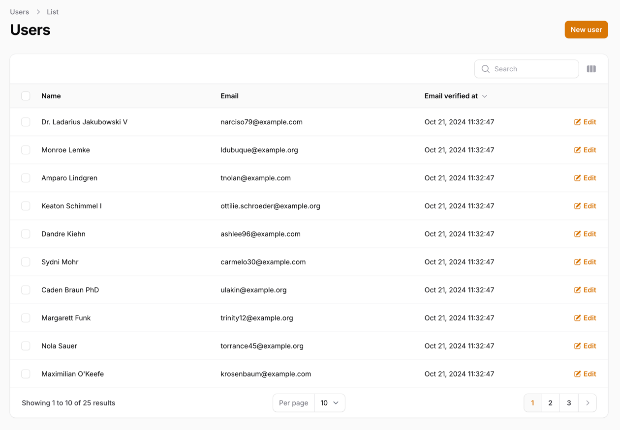
This can be changed by using a custom Theme:
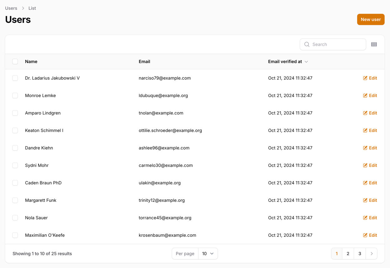
And, of course, if needed, we can even make the table compact with custom CSS:
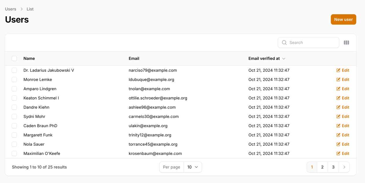
Creating New Theme
We have to create a new theme for this tutorial since we will override some of the Filament design elements.
Let's start by running a console command:
php artisan make:filament-themeThis will create new theme scaffolding for us. But we still have to do two things:
First, we need to configure Vite by adding our theme as a source:
vite.config.js
import {defineConfig} from 'vite';import laravel from 'laravel-vite-plugin'; export default defineConfig({ plugins: [ laravel({ input: [ 'resources/css/app.css', 'resources/js/app.js', 'resources/css/filament/admin/theme.css' ], refresh: true, }), ],});Then we have to register our new theme in a PanelProvider:
app/Providers/Filament/AdminPanelProvider.php
return $panel // ... ->viteTheme('resources/css/filament/admin/theme.css');Once we have done that, we can run:
npm run build# Or we can runnpm run devTo either build production assets or watch for changes.
Removing the Border
To remove the border - we have to modify our theme CSS file:
resources/css/filament/admin/theme.css
@import '/vendor/filament/filament/resources/css/theme.css'; @config 'tailwind.config.js'; .fi-ta-table > tbody { @apply divide-none}This targets our tbody (the body of our table) and applies the divide-none TailwindCSS class to remove dividing borders.
Now, let's compile our assets:
npm run buildAnd after the page is refreshed - we should see that the border is gone:

Compacting the Table
Next, we can make this table more compact (take up less height) by modifying padding on table cells:
resources/css/filament/admin/theme.css
@import '/vendor/filament/filament/resources/css/theme.css'; @config 'tailwind.config.js'; .fi-ta-table > tbody { @apply divide-none} .fi-ta-table > tbody { @apply divide-none} .fi-ta-text { @apply py-0.5} .fi-ta-table > .whitespace-nowrap { @apply py-0.5} .fi-ta-cell > div:has(.flex) { @apply py-0.5}This targets a few things:
-
fi-ta-texttargets text column padding -
.fi-ta-table > .whitespace-nowraptargets the Actions column -
.fi-ta-cell > div:has(.flex)targets the mass action checkbox
Now, let's compile our assets:
npm run buildAnd after the page is refreshed - we should see that our table is compact:

Note: You can experiment with py-XX values to find the height that works best for you!
A few of our Premium Examples:
