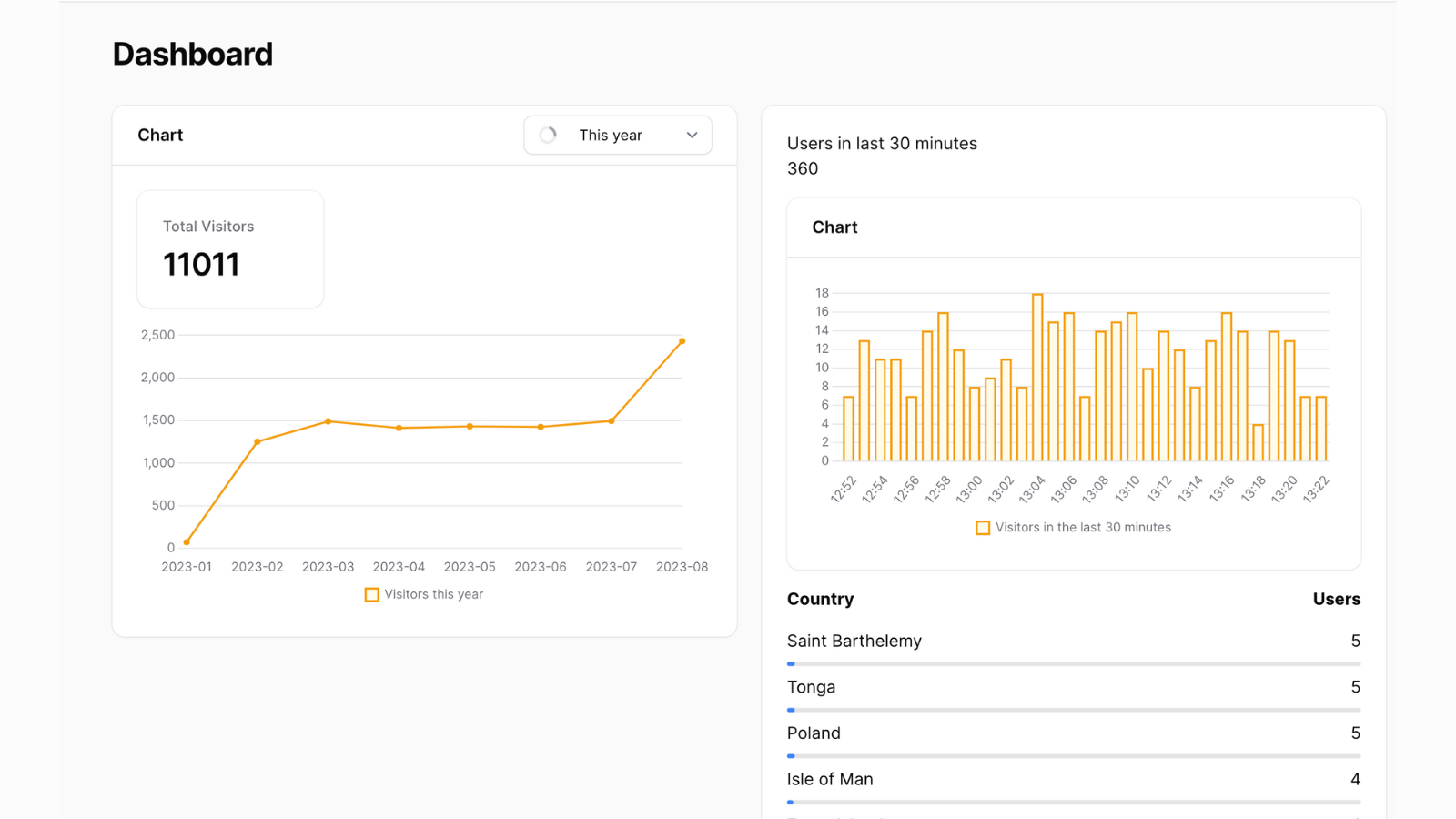
A demonstration of creating dashboard widgets that mimic Google Analytics behavior.
Get the Source Code:
Only This Example
$9
One-time payment
Full source code for Dashboard Charts like Google Analytics
Downloadable ZIP file with the source code
Lifetime access to this example
 Sign in with GitHub to buy
Sign in first, then complete your $9 checkout.
Best value — all 169 examples
View membership plans
FilamentExamples Membership
$99
/year
or
$199
lifetime
Access to code of all 169 examples
Future new examples and updates included
FilaCheck Pro package licence included
MCP server included
30-day money-back guarantee
How it works
The main logic lives in two charts that we have created - VisitorsPerCountry and VisitorsChart:
- Visitors chart simply takes the data and filters it by date range, then counts the visitors per day and returns the array of values.
- Visitors chart also uses Filament recommended package
flowframe/laravel-trendthat's documented here - Visitors per country uses a custom widget with a custom display inside
- This widget uses a custom Livewire component to display a chart that has real-time polling
- Inside we also have a table with the data that's updated in real-time
All of this includes a clever usage of Filament charts/widgets and custom Livewire components. So here's how that looks in code:
Our first chart - VisitorsChart, which displays historical data:
The FULL tutorial is available after the purchase: in the Readme file of the official
repository you would get invited to.