Filament Table as Grid with Cards
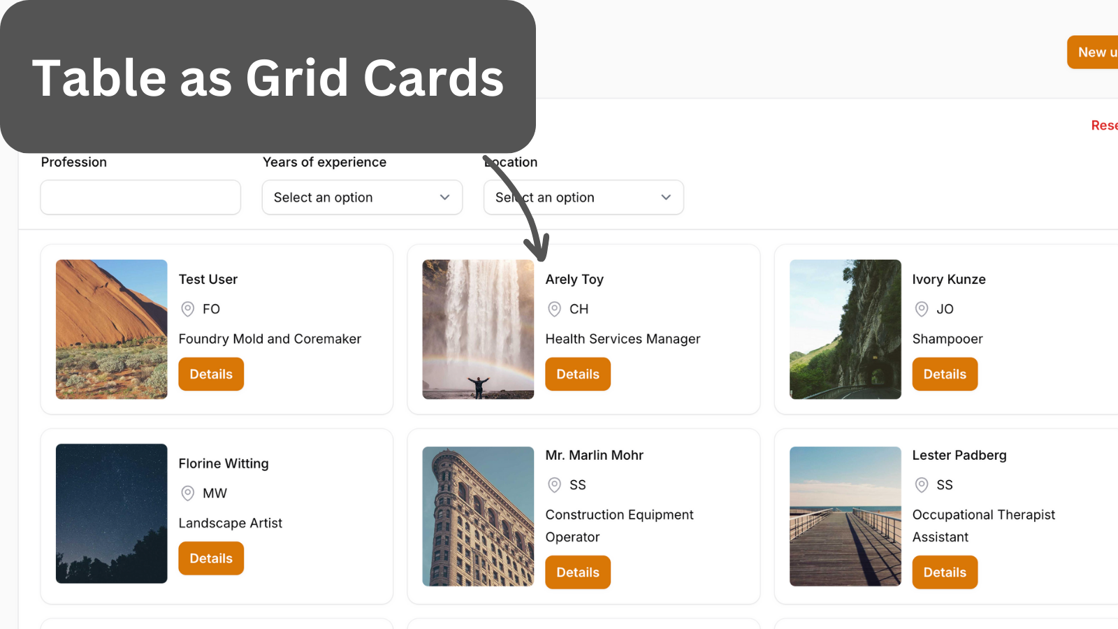
Filament 3Rows are great for displaying number data, but what if we have People portfolios? Then, we can use the Filament Table grid layout to create a unique page feel.
Get the Source Code:
Only This Example
One-time payment
 Sign in with GitHub to buy
Sign in first, then complete your $9 checkout.
FilamentExamples Membership
30-day money-back guarantee
How it works
The whole table logic is in the UserResource Filament Resource.
First, we create a one-column grid layout. Then, we have a split layout. Inside the split, we have a one-column grid layout with an image column. This grid is set not to grow.
The image column has its width and height set so that it takes up the whole card height. Using the extraImgAttributes(), we can add CSS classes to the image element. In this case, we make rounded corners.
Next, we have a stack layout, which allows us to have table columns in one grid column. We set the stack layout to grow and set the spacing for the text columns.
We set the font weight for the name table column using the weight() method. We can also add an icon using the icon() method.
We use a text column for the button and set the default value. In the default value, we return a Filament button Blade component.
app/Filament/Resources/UserResource.php:
use Illuminate\Support\HtmlString;use Illuminate\Support\Facades\Blade;use Filament\Support\Enums\FontWeight;use Filament\Tables;use Filament\Tables\Table; public static function table(Table $table): Table{ return $table ->columns([ Tables\Columns\Layout\Grid::make() ->columns(1) ->schema([ Tables\Columns\Layout\Split::make([ Tables\Columns\Layout\Grid::make() ->columns(1) // ...