
Scatter Chart Widget with Color-Coded Points and Inline Labels
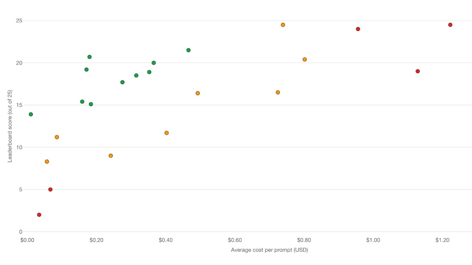
Filament 4/5A Filament ChartWidget rendered as a scatter plot, mapping two numeric dimensions per record onto the X and Y axes. Each point is colored by a computed quality band and labeled inline.
Get the Source Code:
Only This Example
One-time payment
 Sign in with GitHub to buy
Sign in first, then complete your $9 checkout.
FilamentExamples Membership
30-day money-back guarantee
How it works
The whole demo is a single ChartWidget. Three things make it a scatter plot instead of Filament's default bar chart: getType() returns 'scatter', getData() returns {x, y} point objects with parallel color arrays, and getOptions() supplies the axis titles, currency formatting, tooltip, and inline labels. A tiny service layer supplies the underlying rows.
1. The Widget Type — One method turns the chart into a scatter plot
Everything below hangs on the chart type. A ChartWidget defaults to a bar chart; overriding getType() is the single switch that makes Chart.js render an X/Y scatter plot instead.
app/Filament/Widgets/LeaderboardCostChart.php
class LeaderboardCostChart extends ChartWidget{ protected ?string $heading = 'Cost per prompt vs. leaderboard score'; protected ?string $description = 'Green marks the strongest cost-score tradeoffs, amber is mid-range, and red is weakest. Hover for details.'; protected int|string|array $columnSpan = 'full'; protected ?string $maxHeight = '560px'; protected ?string $pollingInterval = null; protected function getType(): string { return 'scatter'; }}The key points:
getType(): stringreturning'scatter'is the entire opt-in — Chart.js reads this to switch from a category axis (bar/line) to a linear X axis, which is what lets each point sit at an arbitrary{x, y}coordinate rather than a fixed category slot$columnSpan = 'full'makes the widget span the whole dashboard grid, and$maxHeight = '560px'gives the plot enough vertical room that points don't collide — scatter plots need more breathing space than a bar chart because the labels sit next to the marks, not under an axis$pollingInterval = nullturns off Filament's default live refresh — the benchmark data is static, so re-querying on a timer would just re-run the service for no visual change
2. The Data — {x, y} points with a color computed per model
A scatter dataset isn't a flat list of numbers like a bar chart; each entry is an {x, y} object, and any extra keys (here model and quality) ride along for the tooltip and labels to read back. The color arrays are built in parallel so the Nth color lines up with the Nth point.