This project showcases Filament form capabilities for applying settings globally and employing grid and group components to arrange inputs in customized positions throughout the form layout.
Get the Source Code:
Only This Example
One-time payment
 Sign in with GitHub to buy
Sign in first, then complete your $9 checkout.
FilamentExamples Membership
30-day money-back guarantee
How it works
First, we have set global settings for some inputs and sections. This means we do not need to set an option for every input.
app/Providers/AppServiceProvider.php:
use Filament\Schemas\Components\Tabs\Tab;use Filament\Forms\Components\Radio;use Filament\Forms\Components\Select;use Filament\Forms\Components\Section;use Illuminate\Support\ServiceProvider;use Filament\Forms\Components\TextInput;use Filament\Forms\Components\DatePicker; class AppServiceProvider extends ServiceProvider{ // ... public function boot(): void { TextInput::configureUsing(function (TextInput $textInput) { $textInput->inlineLabel(); }); Radio::configureUsing(function (Radio $radio) { $radio->inlineLabel(); }); Select::configureUsing(function (Select $select) { $select->inlineLabel(); }); DatePicker::configureUsing(function (DatePicker $datePicker) { $datePicker->inlineLabel(); }); Tab::configureUsing(function (Tab $section) { $section->columns(); }); }}Next, we will go through every tab.
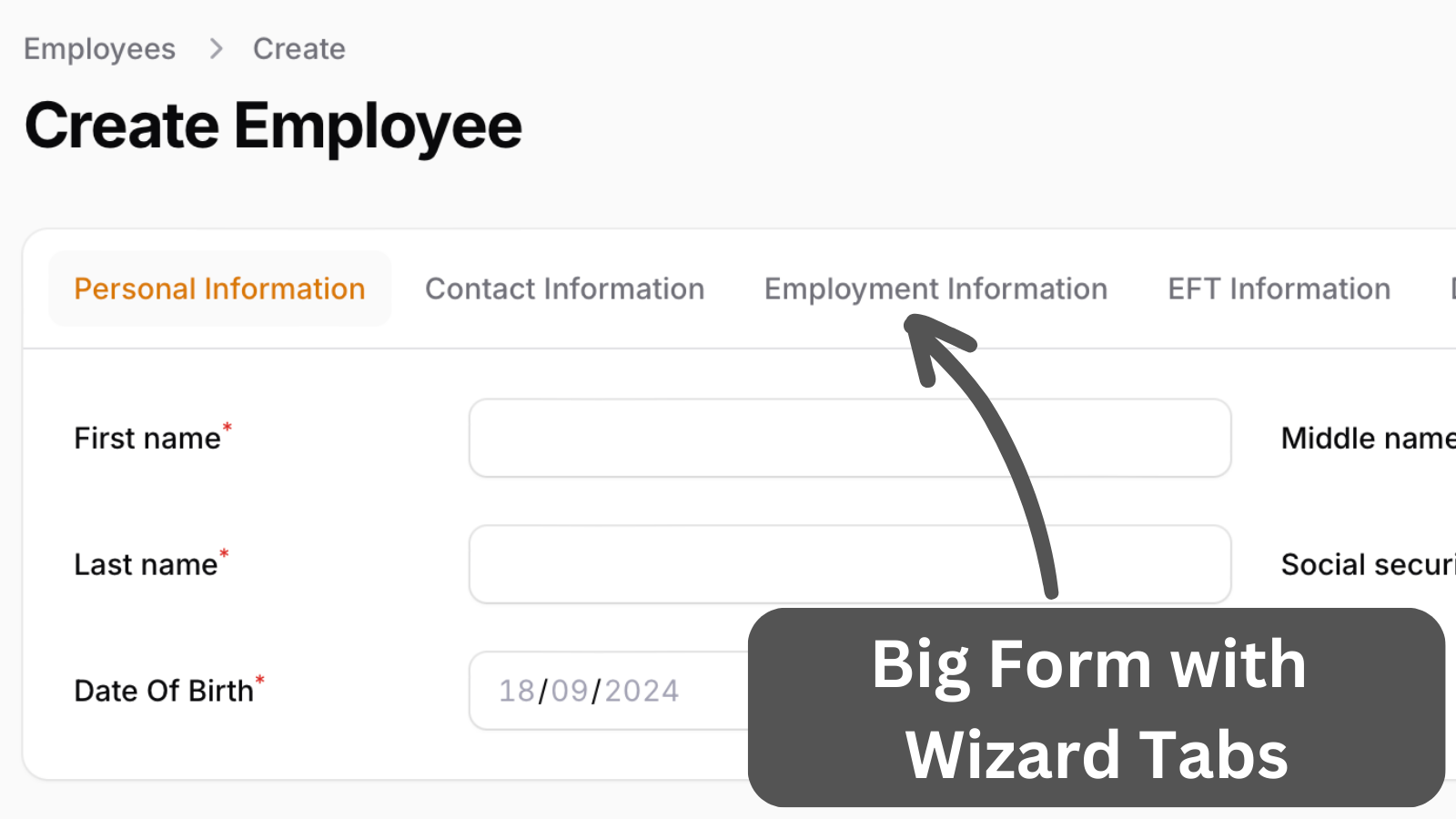
The first tab, Personal Information, has basic text inputs, a date picker, and a selector. The social security number is a mask that only allows numbers and is divided by a dash. The payroll number is shown as a placeholder and is set to be visible only on the edit page.