Branded Filament Panel with Sidebar Profile Card
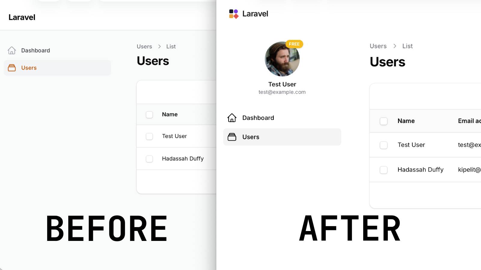
Filament 4/5Turn a default Filament panel into a branded product shell with three drop-in pieces: a borderless white theme, a custom SVG logo with your app name, and a sidebar profile card showing the user's avatar, name, email, and plan badge.
Get the Source Code:
Only This Example
One-time payment
 Sign in with GitHub to buy
Sign in first, then complete your $9 checkout.
FilamentExamples Membership
30-day money-back guarantee
How it works
This project demonstrates how to transform a stock Filament admin panel into a branded shell with three independent pieces: a borderless white theme, a custom SVG brand logo with the app name, and a sidebar profile card showing the current user's avatar, name, email, and plan badge. Each piece lives in its own file — one CSS file, one Blade view, and one render hook — so you can lift any of them into another Filament panel without dragging the others along.
The repository contains the complete Laravel + Filament project to demonstrate the functionality, including migrations/seeds for the demo data.
The Filament project is in the app/Filament folder.
Feel free to pick the parts that you actually need in your projects.
How to install
- Clone the repository with
git clone - Copy the
.env.examplefile to.envand edit database credentials there - Run
composer install - Run
php artisan key:generate - Run
php artisan storage:link - Run
php artisan migrate:fresh --seed(it has some seeded data for your testing) - Run
npm install&&npm run build - That's it: launch the URL
/adminand log in with credentials[email protected]andpasswordor register a new user
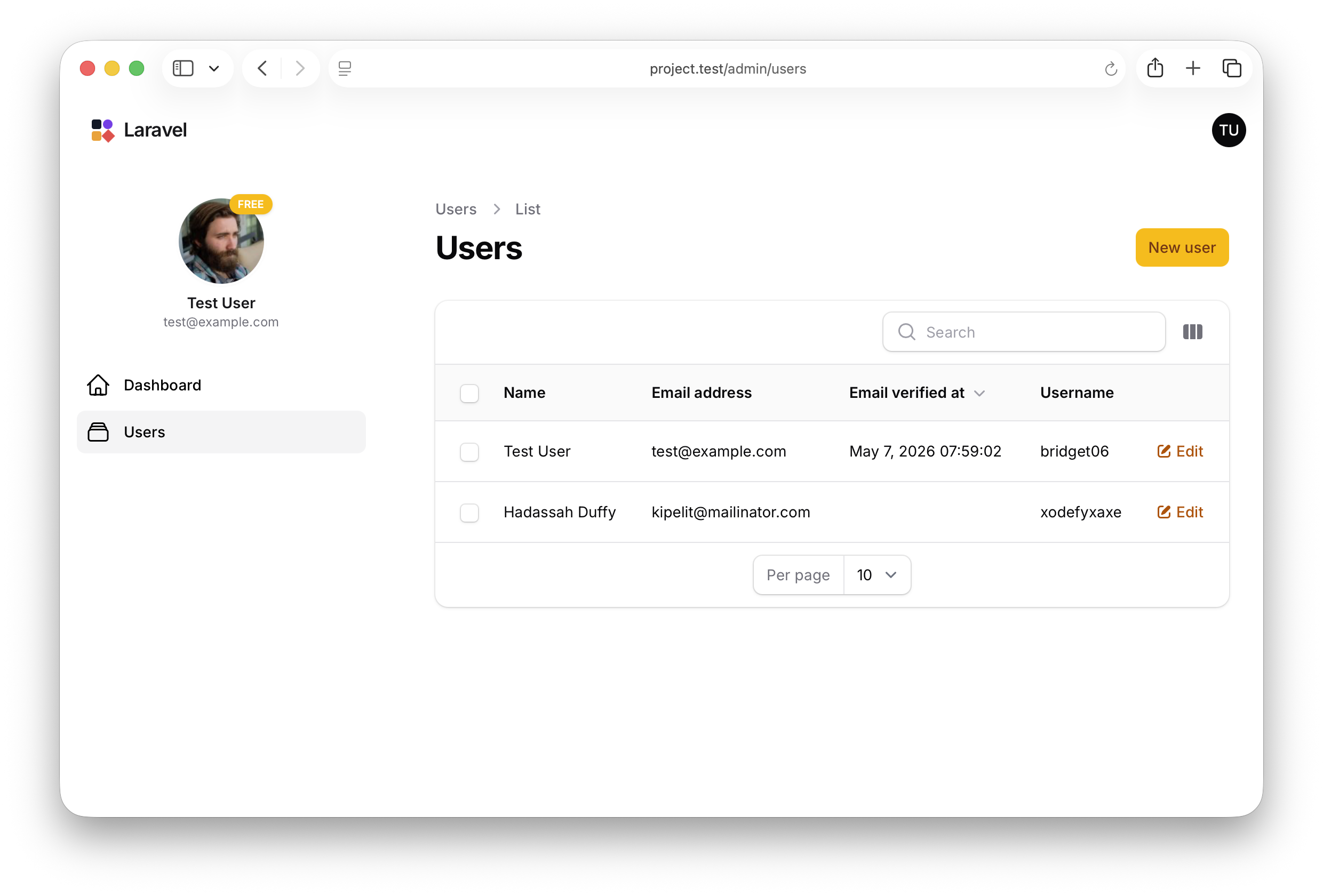
Screenshot
How It Works
The whole demo is wired through AdminPanelProvider::panel() — three method calls register the three customizations, and each customization lives in its own file outside the provider so it can be lifted out independently.
app/Providers/Filament/AdminPanelProvider.php
return $panel ->default() ->id('admin') ->path('admin') ->brandLogo(fn () => view('filament.admin.logo')) ->brandLogoHeight('2rem') ->viteTheme('resources/css/filament/admin/theme.css') ->login(\App\Filament\Pages\Login::class) ->registration(\App\Filament\Pages\Register::class) ->colors([ 'primary' => Color::Amber, ]) ->globalSearch(false) // ... ->renderHook( PanelsRenderHook::SIDEBAR_NAV_START, fn (): string => view('filament.admin.sidebar-profile')->render(), );The key points:
->brandLogo(fn () => view(...))accepts a Closure returning a view, so the logo can be arbitrary HTML — here an inline SVG mark beside the app name, but the same slot could host a wordmark image, an animated logo, or a logo that changes based on the authenticated user->viteTheme('resources/css/filament/admin/theme.css')is what makes the CSS file in step 1 actually load — without this call, dropping rules intotheme.csswould have no effect; Filament wouldn't include the file in the panel's compiled assets->renderHook(PanelsRenderHook::SIDEBAR_NAV_START, ...)injects the profile card above the navigation links — render hooks are Filament's official extension point for slotting custom HTML into the panel chrome without overriding any default views, so future Filament upgrades don't break the customization->globalSearch(false)disables the global search feature panel-wide, which pairs with a CSS rule in step 1 that also hides the search input from the sidebar — disabling at the config level means the keyboard shortcut and the topbar trigger are gone too, not just the sidebar input
1. White Theme — Borderless Panel Chrome
The theme CSS does two things: paints every chrome surface white in both light and dark modes, and strips out the dividing borders and shadows that Filament uses to separate the sidebar, topbar, and main content. The result is a single continuous white canvas with no visible seams between the panel's regions.